K-Nearest Neighbor (Supervised)
KNN is used to classify a new data point. KNN uses its distance from already-known data to calculate which group the new data point should be assigned to. When the new node is added, it looks at the nearest k nodes (based on the Euclidean distance formula) and looks at what group each item belongs to. Then, the newly added item is assigned to the dominant group. It’s important to not make K too big or too small; this can be solved by just some trial and error.
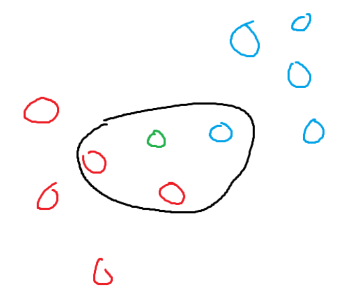
Assume the green node is a new addition and k is currently set to three. The three closest nodes to the green node are two red nodes and one blue node. Red dominates the green node, so the green node becomes a red node.

K-Means Cluster (Un-supervised)
The K-means algorithm is an unsupervised learning technique that is used to group data into K different clusters. K-means is extremely good at categorizing data. K-means will put nodes into different groups because they are similar, but it’s up to humans to determine why they are similar. It might group two movies together, but as humans, we must decide whether it’s the actors, genre, etc. that decide their relationship. The category of a certain data point is decided by the nearest cluster point. The algorithm works as follows:
Place K cluster points randomly in the space.
For each data point inside the system, find the closest cluster point and assign it to the same group.
For each type of different group, find the centroid of the group. The centroid is the average of a group. It can be easily expanded to further dimensions. The general equation goes as follows for (x,y) cordiantes (sum(x) / len(points), sum(y) / len(points))
Repeat, starting back at step 2. The algorithm should terminate when no changes happen for an iteration.
To guarantee a good categorization, K-means needs to run a lot of times. At the start of the algorithm, it chooses random positions for the clusters to start at. This may lead to it converging to local minima instead of the globally best answer. So, the algorithm should be run multiple times, each with different initial locations, and the best one to come out of those is the one that is kept.
The main parameter that needs to be fine-tuned for good categorization is the number of clusters. If there are n data points and there are n different cluster points, then the algorithm will end up giving each data point its own cluster point. Not much information can be gained from this. There is a relationship between the number of clusters that are being used and variation.
As the number of clusters increases, the variance decreases. As hinted earlier, variance is equal to 0 when the number of data points matches the number of clusters. If the change in variation for each amount of clusters is plotted, it resembles a graph that plateaus. The best K value is the value where the graph starts to plateau; this is called the elbow.
Naive Bayes:
Naive Bayes is best described in one of its most practical uses. Naive Bayes is used all the time in email spam classifiers. It takes advantage of the fact that spam emails are more likely to contain specific words such as free, money, and won. The algorithm goes as follows:
Determine the probabilities for both words in normal emails and words in spam emails. To calculate the probability of a word appearing in a normal message, find how many times it appears, then divide it by the total number of words. The same goes for spam messages.
We also want to determine a good initial value. We want to know the initial probability of any message being normal or spam. This can be done with already-collected data on spam and normal messages. You can find the probability by dividing the number of normal messages by the total number of messages.
Time for calculations. This should be done using the normal probabilities and the spam probabilities. The general formula for calculating goes as follows: (n = frequency of that word in that message being inspected.) I know I used one variable, but assume there are individual frequencies.
(Intial guess for being that type) * (probability of word A in this type)^n * (probability of word B in this type)^n…
After the calculation for normal messages and spam messages is done, Whichever yielded a smaller value is considered to be the computer’s guess as a classification.
However, there is a slight issue with how the algorithm is conducted. If there is a word in the spam problem that does not exist in the normal probabilities, then, when calculating the normal, it will return 0. So, it will also classify the message as a normal method. This is circumvented by simply adding a count of one to each word frequency. This guarantees that nothing will be multiplied by 0 and that the relationships between numbers stay the same since the same amount was added to each.
Naive Bayes is naive because it only looks at a very small part of the entire message. In naive bayes, free money and money free mean the exact same. Naive Bayes does understand the email; it only understands the chances of a single isolated word being part of a normal message or spam message.
PCA (Principle Component Analysis)
Principle Component Analysis is a method used to figure out the importance of each “component”. It is good at creating visualizations that humans can understand (1D, 2D, 3D) from data that exsits in higher dimensions. It shouldn’t be suprising that certain trait differentiate themselves from others node more. If your data is about heart disease then, there are certain “unessary” components to keep track of. For example, extremely high blood pressure plays a massive role in determining whether someone has a heart disease. While the color of someone’s eyes doesn’t play a very big role and there is practically no differnce in a decision being made using eye color or not. This you have higher dimensional you could reduce the dimensions to improve visualization by dropping traits like eye color. PCA is an algorithim that is able to determine the importance of certain components. An n-dimensional data will have n different principle components. The algorithim goes as follows:
Find the center of the current data points. This could be done by finding the centroid of them. Then, move the centroid to the origin bringing the data points with it. This means the origin is also the centroid and none of the relationships had changed
To Find the first PC find the line of best fit that intersects the origin. The line of best fit is the line than minimizes the squared distances. Once the line is calculated you will know the slope of it. The slope can be reprsented as a unit vector (A vector with length 1).
Assume the x axis is trait 1 and the y axis is trait 2. Then, the PC vector of [3,1] means the current PC is a linear combination of 3 parts trait 1 and 1 part trait 2.
To find any of the following PC find the best fit line that is also perpendicular to the PC lines that came prior. So, if you are finding PC 2 you must find the best fit line which is perpendicular to PC 1. If you are finding PC 3 then you must find a line perpendicular to PC 1 and PC 2. Continue this process until all principe components have been found.
We wish to find a new graph where the axes are each a PC component. Project each data point onto each principle component line. Then rotate, all of the component lines until PC 1 takes the same position as the original x axis.
Now by finding the intersection of the projections produced from a data point in the new space the new cordiantes can be determined
Now in order to determine the variation (roughly the importance of a certain trait) take the sum squared distances for each principle componennt. The general formula goes as follows
((distance of point1 from PC line) ^2 + (distance of point2 from PC line )^2 …. +(distance of point n from PC line)^2) / (total point – 1) = variation of that PC
Principle components that have a higher variations are more key to accurately representing the data.
With the newly found data some optimiziation can be done to cut out unessary information and it also allows for eaiser visualization at the cost of some data loss.
Decision Trees
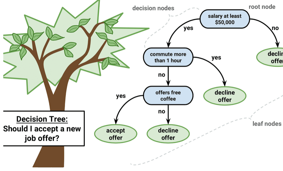
All of us have seen some sort of decision tree. To the left is an example of the decision tree used to decide whether someone should accept a job offer. A common method for classifying or predicting in machine learning is using decision trees. An algorithm will create some sort of decision tree, and when new entries are added, they are determined by using that decision tree. However, getting a good decision tree is a little complicated.
Image Source: https://medium.datadriveninvestor.com/decision-trees-lesson-101-f00dad6cba21

Confusion matrix, sensitivity, and specificity
The Confusion Matrix
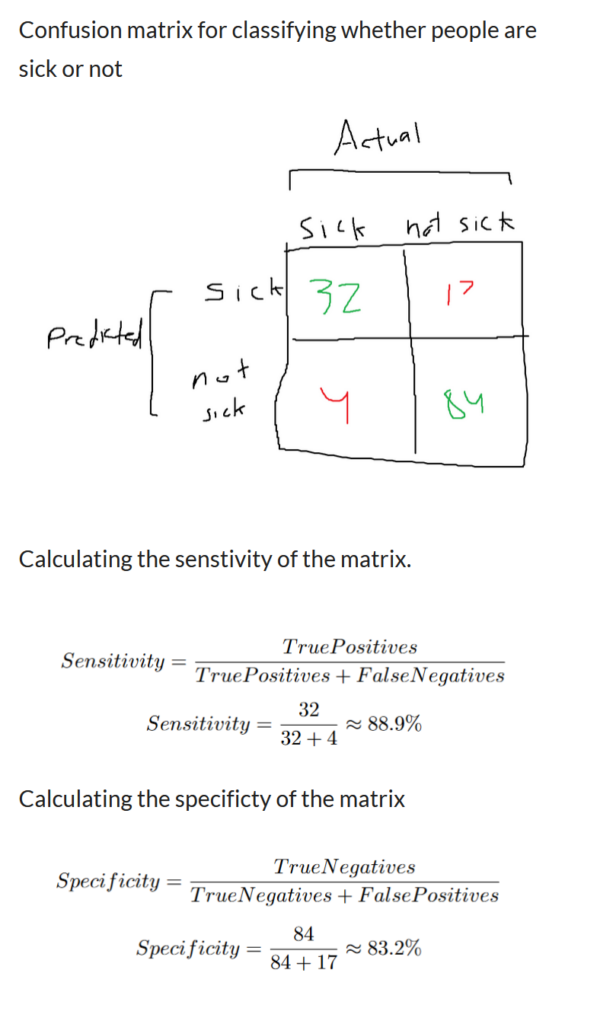
A confusion matrix is a method used to quantify how well a machine learning algorithm performs at classifying. You can get an overall general performance, but it also provides information on its performance for classifying certain scenarios. Confusion matrices are always in the form of an N*N matrix. Where the rows are all of the predicted values and the columns are all of the actual values, Refer to the image on the right, which supposedly classifies something as either sick or not sick.
Each of the cells in the confusion matrix tells us something different.
Top Left Cell: The model guessed that the patient was sick and that the patient was actually sick (true positives).
Top Right Cell: The model guessed that the patient was sick, but they were actually not sick. (False positives)
Bottom Left Cell: The model assumed the patient wasn’t sick, but they were actually sick (false negatives).
Bottom Right Cell: The model guessed the patient wasn’t sick, and they were actually not sick. (True Negatives)
With the four values, we are able to quantify how well the model performed. All of the values along the main diagonal (top left to bottom right) are scenarios where the model has guessed correctly. In our scenario, this includes the scenario where the patient was sick and the model correctly guessed that they were sick. as well as the scenario where the person wasn’t sick and the model correctly guessed that the patient wasn’t sick. You can predict its accuracy by using the following formula: amount classified correctly divided by the total amount tested. In our scenario, it would be (32 + 84) / (32 + 84 + 17 + 4), which yields around 86% accuracy. A confusion matrix can be expanded to any number of classifications, and it follows the same rough generalization.
Sensitivity and Specificity:
Sensitivity and specificity are two different ways to dig deeper into the performance. So far, we know how well the model predicts in general. But how about determining how well the model is at correctly classifying people who are sick or how good it is at identifying those who aren’t sick?
Sensitivty: This tells how good the model is at predicting people who are sick.
The first column contains all of the values for people who were sick. The people who were correctly identified as sick and those who were sick but weren’t classified properly should be included in the calculation. Refer to the equation on the right.
Specificity tells how good the model is at predicting people who were correctly identified as not being sick.
The second column contains all of the values of people who were not sick. It includes the values for people who were classified as not sick correctly and incorrectly. Refer to the equation on the right.
The model ended with 88.9% sensitivity and 83.2% specificity. This means that the model is significantly better at identifying those who are sick than classifying people who are not sick as not sick. Whether a higher degree of specificity is better depends on the scenario. It all depends on whether you think classifying positives is more important than classifying negatives.

Support vector machines
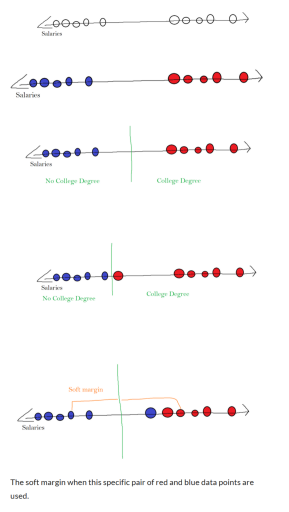
Support vector machines are best introduced using an example. The following example is a number line that represents a salary. It can be observed that there are two different clusters. One near the higher salaries and another towards the lower salaries. Refer to the picture on the right. Let’s say that using this data, we wanted to predict whether someone had a college degree or not based on their salary. We could try this by creating a barrier. On one side lay all of the people with a college degree, and on the other side were all of the people without a college degree. Assume in the following example that blue dots represent people without college degrees and red dots represent people with college degrees.
A good barrier to draw could be the middle between the leftmost red data point and the rightmost blue point. The barrier might look something like the third image on the right.
However, this method is extremely susceptible to outliers. What if a red node had laid extremely close to blue nodes? It would put the barrier too close to the blue cluster. Refer to the fourth image on the right.
So in order to create a good barrier, we have to allow some outliers. To figure out which barrier is best for splitting our data, we will use cross-validation. The algorithm for this scenario will test a barrier in the middle of every pair of data points (it could test between red and blue or two of the same color). It will go through every single barrier each time it tests them against some testing data. Then, the best barrier is the one that is used. Prior to using a barrier that didn’t allow outliers, it strictly defined two different areas. When we include outliers, we create a soft margin. The soft margin is the distance to the margin for each pair of data points. Refer to the 5th image on the right. Finding the correct soft margin is equivalent to using a support vector classifier to classify data points.
However, as always, there is an issue when using a basic support vector classifier in all of these problems. What if your data had looked like the following? A blue dot represents a person who disliked the porridge, and a red dot represents a person who liked the porridge. It is once again on a number line, which represents the temperature of the porridge. If the porridge was too cold, they didn’t like it, and if the porridge was too hot, they didn’t like it. They only liked it when it was just right.
With the given example, it is possible to solve this problem using multiple support vector classifiers. There is one margin between the first blue cluster and the red cluster. then, for one margin between the red cluster and the second blue cluster. This only works because of the amount of data present. If there were billions of points of data, multiple different variables, and more clusters, then this method would become unrealistic.
In order to deal with this information, we need to bring it to a higher dimension. For our 1-dimensional data, we need to display it on a 2D coordinate plane. The position on the number line is determined by the temperature. The new point on the 2D plane is represented by (tempature, tempature ^2).
Being in a higher dimension gives us some advantages. It appears a lot easier to fit a 2D line to the data to make that our margin. So the same algorithm for finding a margin that allows outliers is again used. But instead of creating a one-dimensional barrier, it creates a line. This is the primary idea behind support vector machines. This is specifically called the polynomial kernel function. It is generalizable for higher dimensions. If we wanted to bring our original 1D data into 3D because 2D didn’t get the job done, the ordered triple would be (tempature, tempature ^ 2, tempature ^3) and the barrier would be a plane instead of a line. To figure out what the best dimension is to bring the data into, we could once again use cross-validation, where we test each and choose the best.
There is also something called a radial kernel, which has a lot of similarities to KNN. However, it is a weighted version of KNN. When a new data point is added in higher dimensions, the closer a data point is to the new value, the more effect it has on the final decisions.
